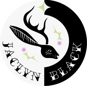
When studying fonts and how they are created, I decided to make a font that represented one of my favorite movies, 'Beetlejuice'. I wanted a whimsical, "Tim Burton feel" for my font that was edgy, a little spooky, and had a story. I decided to put it onto a movie poster to tie it all together. With Beetlejuice's classic black and white striped suit, along with the featured striped snake creature, I wanted to emphasize that illusionistic pattern while keeping other colors at a minimum, with only subtle hints of that recognizable purple and green from the movie.


To the left is my original design. I felt as though it was flat and lacking interest, which resulted in me redesigning the classic snake creature featured in the movie and weaved it in through the house, which is also a main factor of the movie. While adding interest, I didn't want to overpower my font, so I reduced the amount of color.